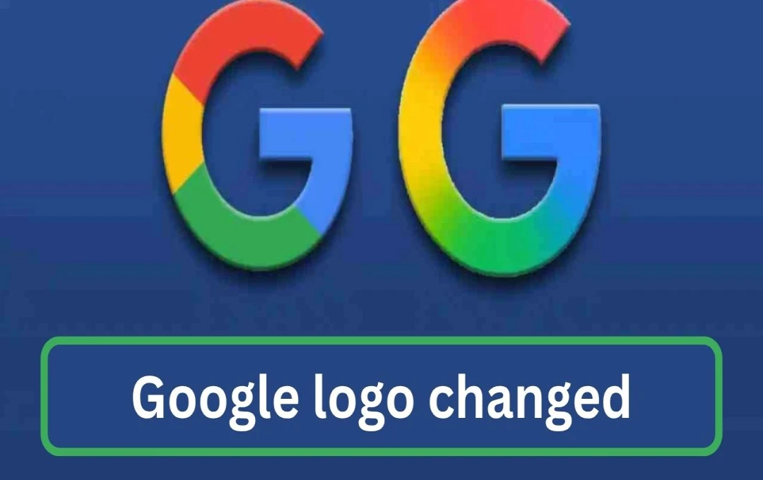
Significant technological advancements often stem from seemingly small changes, and Google has once again demonstrated this principle. After nearly 10 years, Google has redesigned its iconic 'G' logo. This change signifies not merely an alteration in colors but also points towards the future direction of Google.
Google New Logo: Google has unveiled a new, modern iteration of its renowned 'G' logo, marking its first major visual update since 2015. The previous logo featured solid red, yellow, green, and blue colors. The new design incorporates these four colors as fluid gradient shades. This means the colors now blend smoothly into one another, resulting in a more dynamic and futuristic appearance. While seemingly subtle, this change clearly reflects Google's AI-centric approach and its alignment with the evolving digital landscape.
What's New About the Google Logo?
Google's old logo consisted of four solid colors—red, yellow, green, and blue—presenting a b and stable identity. However, it has now received a fresh update. The new logo features fluid gradient shades, meaning the colors blend seamlessly. While retaining the familiar color scheme, the colors appear more dynamic, vibrant, and modern.
This design is particularly well-suited for digital screen technology. It appears clearer and more attractive on smaller screens. Furthermore, it aligns with the logo of Google's recently launched Gemini AI assistant, which already incorporates a blue-to-purple gradient.
Reason Behind the Change
Google's logo change is not merely a visual refresh. It's part of the AI-driven vision Google is incorporating into its upcoming products and services. The company has invested heavily in AI in recent years, across various platforms including Search, Gmail, Google Photos, and Google Workspace. Google now wants its brand identity to reflect this transformation.
Google's design experts believe that gradients, in contrast to flat colors, symbolize "transition" and "flow," mirroring the learning and adaptation capabilities of AI. The new 'G' logo confirms that Google is no longer just a search engine; it has evolved into an AI-powered tech ecosystem.
Where Did It Start?
The new 'G' logo was first observed on the iOS platform. iPhone users with the latest version of the Google Search app started seeing the new logo. On Android, it's currently limited to the beta version (v16.18), with priority given to Pixel phones. Google hasn't yet initiated a full global rollout. The web version, other Android devices, and Chrome browser still display the older logo. However, according to the company's strategy, the new logo will gradually appear on all platforms in the coming weeks.
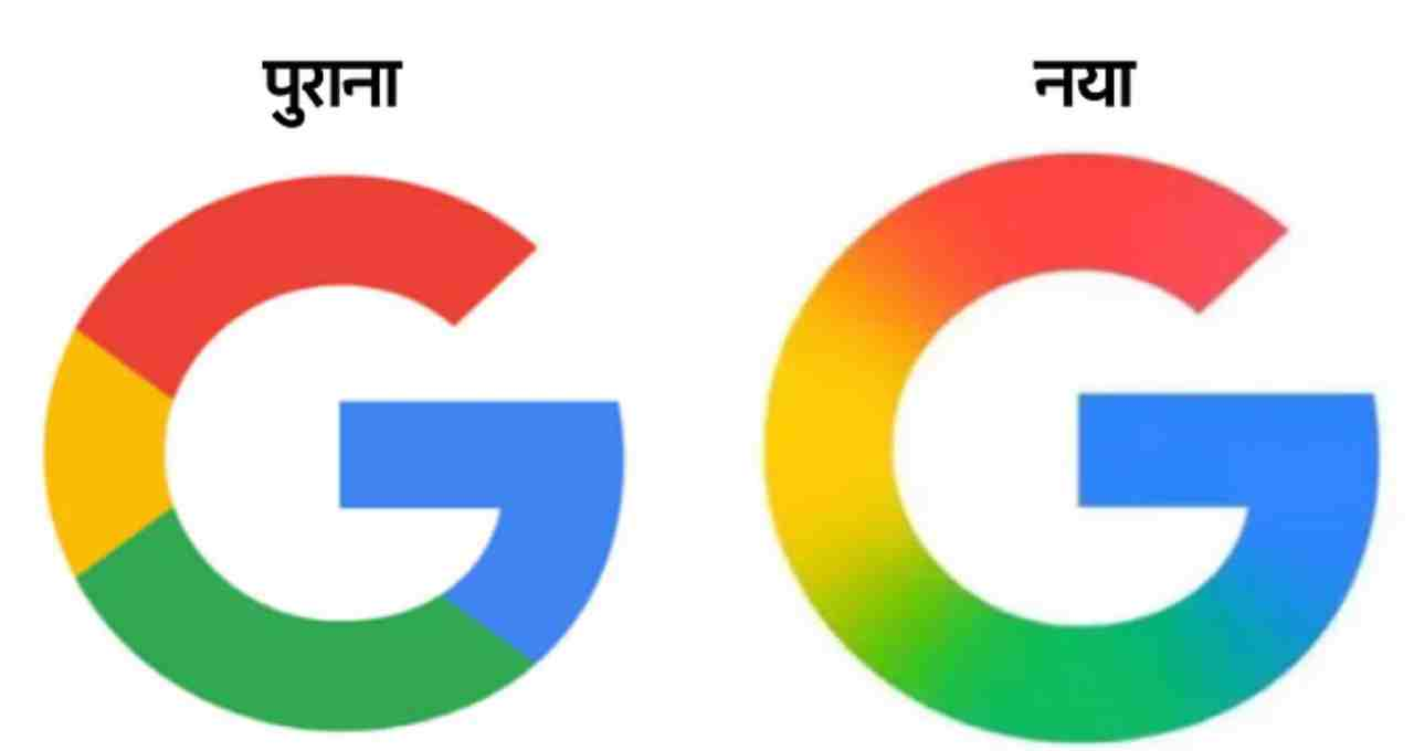
It's noteworthy that Google last changed its logo in 2015, replacing its older serif font with a sans-serif font. That change aimed to improve readability and recognition on mobile screens. Now, almost a decade later, Google has introduced a similar transformation—this time to signify the dawn of the AI era.
Design and technology experts consider this change small yet impactful. Social media reactions have been mixed. Some users describe it as "minimal and beautiful," while others find the change too subtle. However, most view it as a smart move in terms of AI branding.
